
MACD (Moving Average Convergence Divergence) is an indicator that tracks the gap between two moving averages of a stock's price. Traders use it to visualise momentum: whether recent price action has been speeding up or slowing down relative to the slightly older action.
What are the parts of the MACD?
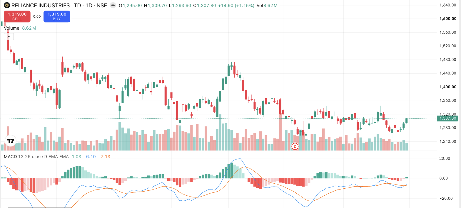
MACD appears in a panel below the price chart and has three components, all built from exponential moving averages (EMAs):
- The MACD line, the 12-period EMA minus the 26-period EMA. When recent prices run ahead of older prices, this line rises above zero; when they lag, it falls below.
- The signal line, a 9-period EMA of the MACD line itself. A smoothed, slower version that trails the first line.
- The histogram, vertical bars showing the gap between the two lines. Bars grow when the MACD line pulls away from the signal line and shrink as they converge.
The 12/26/9 settings are decades-old defaults; platforms let you change them, but most people leave them, which is precisely why the default readings are widely watched.
How do traders read it?
Three commonly watched events:
- Signal-line crossover. The MACD line crossing above the signal line is conventionally described as bullish; crossing below, bearish. Neutrally stated, a bullish crossover records that short-term momentum has just turned up relative to its own recent average. A description of what has already happened, and one that appears constantly, including many times inside sideways chop.
- Zero-line cross. MACD above zero means the 12-EMA is above the 26-EMA. Recent average prices are higher than older ones. Below zero, the reverse.
- Histogram shrinking. When the bars start contracting while price still pushes on, traders read it as the move losing acceleration. The same "divergence" idea used with RSI.
Let's watch one play out. Farhan is following Godavari Foods, a fictional FMCG stock drifting down from ₹620 to ₹560. Through the fall, MACD sits below zero. Then the fall flattens near ₹560; the histogram bars, deeply negative, shrink towards zero; finally the MACD line crosses above the signal line. Farhan doesn't treat this as "the bottom is in", crossovers near a low often fizzle. He treats it as the chart noting that downside momentum has faded, and looks at the price chart itself: is there a base forming, a resistance level overhead, decent volume on up-days? MACD started the question; it can't answer it alone.
What are MACD's blind spots?
Because it's built entirely from moving averages, MACD inherits their lag. Every crossover confirms a shift after a chunk of the move has occurred. Its worst environment is a rangebound market, where the lines braid around each other and produce crossover after meaningless crossover. And its raw value is in price units, so a MACD of 4 on a ₹3,000 stock is trivial while 4 on a ₹100 stock is enormous. You can't compare MACD values across stocks, only shapes within one chart.
Things to keep in mind
- MACD repackages moving-average behaviour; it contains nothing the price chart doesn't already contain, and it always lags.
- Crossovers are frequent, commonly watched events, not commitments from the market. Sideways phases generate strings of failed ones.
- Compare MACD only with the same stock's own history, never across stocks.
- Readings change entirely with the chart timeframe; note it before drawing conclusions.
Read next
What are Bollinger Bands? — An indicator built on volatility instead of momentum.