
Every fund's own page on Rupeezy carries a graph of its NAV over time — its NAV chart — with buttons to switch the period from 3 months to 10 years, and a return comparison against the category average sitting right above it. This is about the fund's own price history — not the list of your mutual fund investments; see How to view mutual fund investments on Rupeezy? for that.
How do I read a fund's NAV chart?
1. Open the fund's scheme page — tap a fund's name, or tap any fund in search results. See How to check mutual fund scheme details on Rupeezy? for the rest of that page.
2. Scroll to the chart — it sits directly below the Category Average / This Fund return pair, with the period buttons underneath it.
3. Tap a period button — 3M, 6M, 1Y, 3Y, 5Y or 10Y. The chart and the return pair above it redraw together for whichever period you pick.
4. Press and hold a point on the line — a box at the top of the chart shows that day's NAV and date, for as long as you keep touching it.
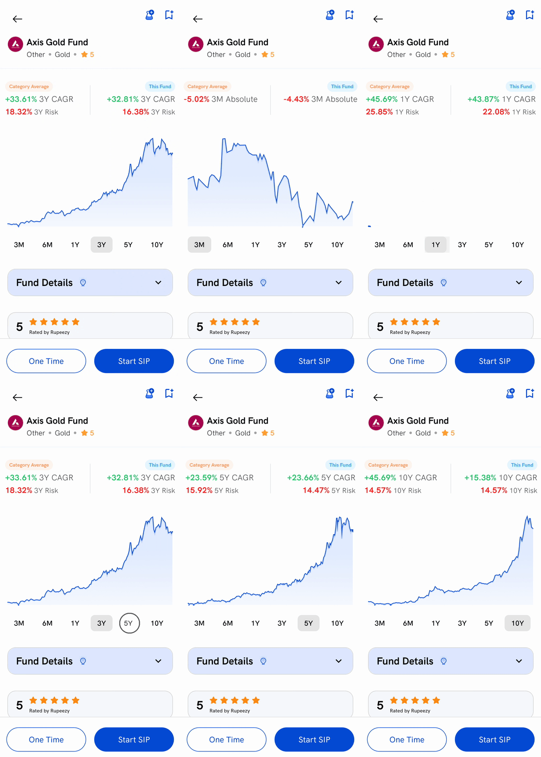
You won't always see all six buttons — see "Things to keep in mind" below.
What do Category Average and This Fund mean?
Two figures sit just above the chart, for whichever period you've picked: Category Average (funds like this one) and This Fund (the scheme you're looking at). Each shows a return, labelled CAGR for 1Y and longer, or Absolute for 3M/6M — a return under a year isn't annualised, so Rupeezy doesn't call it CAGR.
Below the return, when Rupeezy has one for that period, a second line reads Risk — how much the fund's returns have swung over that same period. This is a different figure from the Risk further down the page under Fund Performance, which stays fixed to the past three years no matter which chart period you're on; see How to check mutual fund scheme details on Rupeezy?.
What happens when I tap the chart itself?
The chart carries no other date labels — pressing the line is the only way to read one. Wherever you touch, Rupeezy finds the closest day and shows its NAV and date in a box at the top, for example NAV: ₹16.42 | October 21, 2022. Lift your finger and the box disappears.
Things to keep in mind
- The buttons you see depend on the fund's age. A fund younger than 10 years doesn't show 10Y; one younger than 6 months shows only 3M.
- The chart doesn't always open on the same period. It opens on 3Y for a fund that old, 1Y for a younger one, or the shortest period the fund has.
- The Risk line isn't always there. It only appears — under Category Average, This Fund, or both — when Rupeezy has a figure for that period.
- Everything here is past performance, not a promise of future returns.