
A trend is the overall direction a stock's price has been moving, up, down, or sideways. A trendline is simply a straight line drawn on the chart connecting the swing points, to make that direction easier to see.
How do traders define an uptrend and a downtrend?
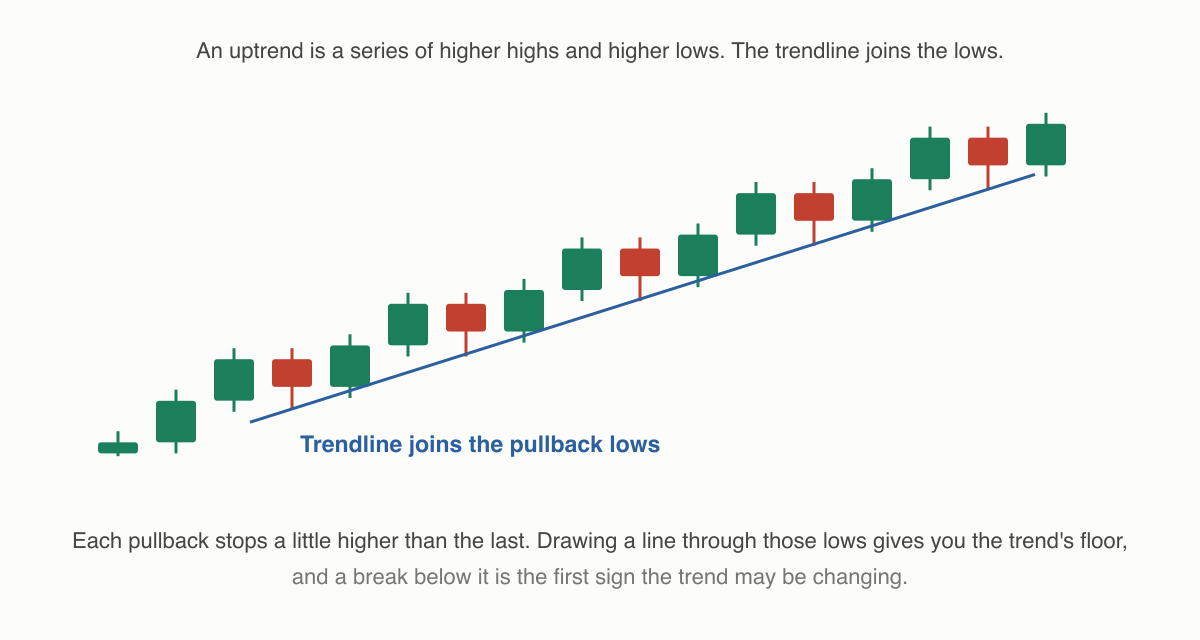
The classic definitions use swing highs and swing lows. The local peaks and dips a price makes as it zigzags:
- Uptrend, a sequence of higher highs and higher lows. Each rally goes further than the last, and each dip stops above the previous dip.
- Downtrend, lower highs and lower lows. Each bounce is weaker, each fall goes deeper.
- Sideways (range-bound), highs and lows at roughly the same levels, with price oscillating between them.
Take Kaveri Motors over four months: it dips to ₹210, rallies to ₹240, dips to ₹222, rallies to ₹255, dips to ₹235, rallies to ₹270. Lows at ₹210 → ₹222 → ₹235 and highs at ₹240 → ₹255 → ₹270: higher lows, higher highs, an uptrend by the textbook definition. No prediction is involved; the labels just describe the sequence that has already printed.
How do I draw a trendline?
In an uptrend, draw a straight line connecting two or more of the higher lows and extend it right. That rising line under the price is the trendline. In a downtrend, connect the lower highs so the falling line sits above the price. A trendline needs at least two swing points; a third touch is when many traders start taking it seriously.
The trendline behaves like a sloped version of support and resistance: a rising trendline marks the zone where dips have kept finding buyers. When price closes decisively through a trendline, traders read that as the rhythm changing, not proof of reversal, just the earlier pattern of higher lows failing to repeat. Some then wait to see whether a lower low forms before calling the uptrend over.
What about sideways markets?
A truth beginners underestimate: markets spend a lot of their time trending nowhere. A stock can spend months shuttling between ₹300 and ₹330 without making meaningful new highs or lows. Trend-following tools frankly struggle here. Trendlines keep breaking, and moving averages flatten and whipsaw. Recognising "this is a range, not a trend" is itself a valuable chart-reading skill, because it warns you that trend-based interpretations are on weak ground.
Trends also depend on the timeframe. Meera sees an uptrend on Kaveri Motors' daily chart while the 15-minute chart shows a two-day downtrend inside it. Both descriptions are simultaneously true, as explained in what are OHLC and chart timeframes.
Does a trend tell me what happens next?
No. "The trend is your friend" is a popular saying because trends often persist for a while, but every trend ends, and the chart never announces the ending in advance. A five-month uptrend can reverse on a single results announcement. Traders use trend analysis to organise their view (which side of the market has recently been in control?) and then manage risk separately, rather than assuming continuation.
Things to keep in mind
- Higher highs + higher lows = uptrend; lower highs + lower lows = downtrend; neither = range. Label first, interpret second.
- Trendlines are hand-drawn. Two chartists can draw them slightly differently, and both are defensible. Treat them as zones.
- Sideways phases are common and normal; trend tools give their least useful readings there.
- A broken trendline shows the old rhythm has changed. It does not guarantee a reversal, or anything else.
Read next
What are support and resistance? — The price levels where trends pause, and often reverse.