
A candlestick chart shows the price movement of a stock as a series of "candles", where each candle summarises one time period, a minute, a day, a week. One glance at a candle tells you four things: where the price opened, the highest and lowest it went, and where it closed.
What are the parts of a candle?
Every candle has two parts:
- The body, the thick rectangle. Its top and bottom mark the open and close of that period.
- The wicks (also called shadows), the thin lines above and below the body. They mark the high and the low touched during the period.
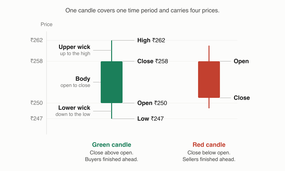
The colour tells you which way the period went:
- Green (or white). The close was above the open. Buyers finished the period ahead.
- Red (or black). The close was below the open. Sellers finished ahead.
So a long green body says buyers dominated; a long red body says sellers did. Long wicks say the price travelled far but was pushed back, the period's extremes didn't hold.
Can we walk through one real candle?
Let's read one daily candle of Kaveri Motors, a fictional stock, on a Tuesday:
| Value | Price |
|---|---|
| Open | ₹250 |
| High | ₹262 |
| Low | ₹247 |
| Close | ₹258 |
The candle is green, because ₹258 (close) is above ₹250 (open). The body stretches from ₹250 to ₹258. The upper wick runs from ₹258 up to ₹262, at some point buyers pushed the stock to ₹262, but it couldn't stay there. The lower wick runs from ₹250 down to ₹247, sellers briefly dragged it below the open, and buyers pulled it back.
Reading it as a story: the stock opened at ₹250, dipped to ₹247, rallied as high as ₹262, and settled at ₹258. Net result, a day buyers controlled, with some selling near the top. That's the whole skill: turning four numbers into a picture of who was in charge.
What do different candle shapes suggest?
Traders give recurring shapes names. A tiny body with long wicks is a "doji", a small body with a long lower wick is a "hammer", and read them as clues about the balance between buyers and sellers. We cover the popular ones in what are common candlestick patterns like doji, hammer and engulfing. Remember the framing: a shape describes what happened in that period. It is often interpreted as a hint about sentiment, but it never guarantees what the next candle will do.
Does the timeframe change what a candle means?
Yes, a candle only summarises its own period. On a daily chart, one candle is one trading day; switch to a 5-minute chart and the same day becomes about 75 separate candles, each with its own open, high, low and close. The four values behind every candle are explained in what are OHLC and chart timeframes. Intraday traders read fast timeframes; investors usually read daily or weekly candles.
Things to keep in mind
- A candle records the past period only. A strong green candle does not mean the next candle will also be green.
- Always check which timeframe you're viewing. The same stock can look bullish on a daily chart and weak on a 15-minute chart at the same moment.
- Single candles are noisy. Traders usually read them in context. Near a support or resistance level, or alongside volume.
- Colour conventions can be customised in most charting tools; confirm your settings before reading someone else's screenshot.
Read next
What are common candlestick patterns like doji, hammer and engulfing? — Individual candles start forming shapes worth recognising.