
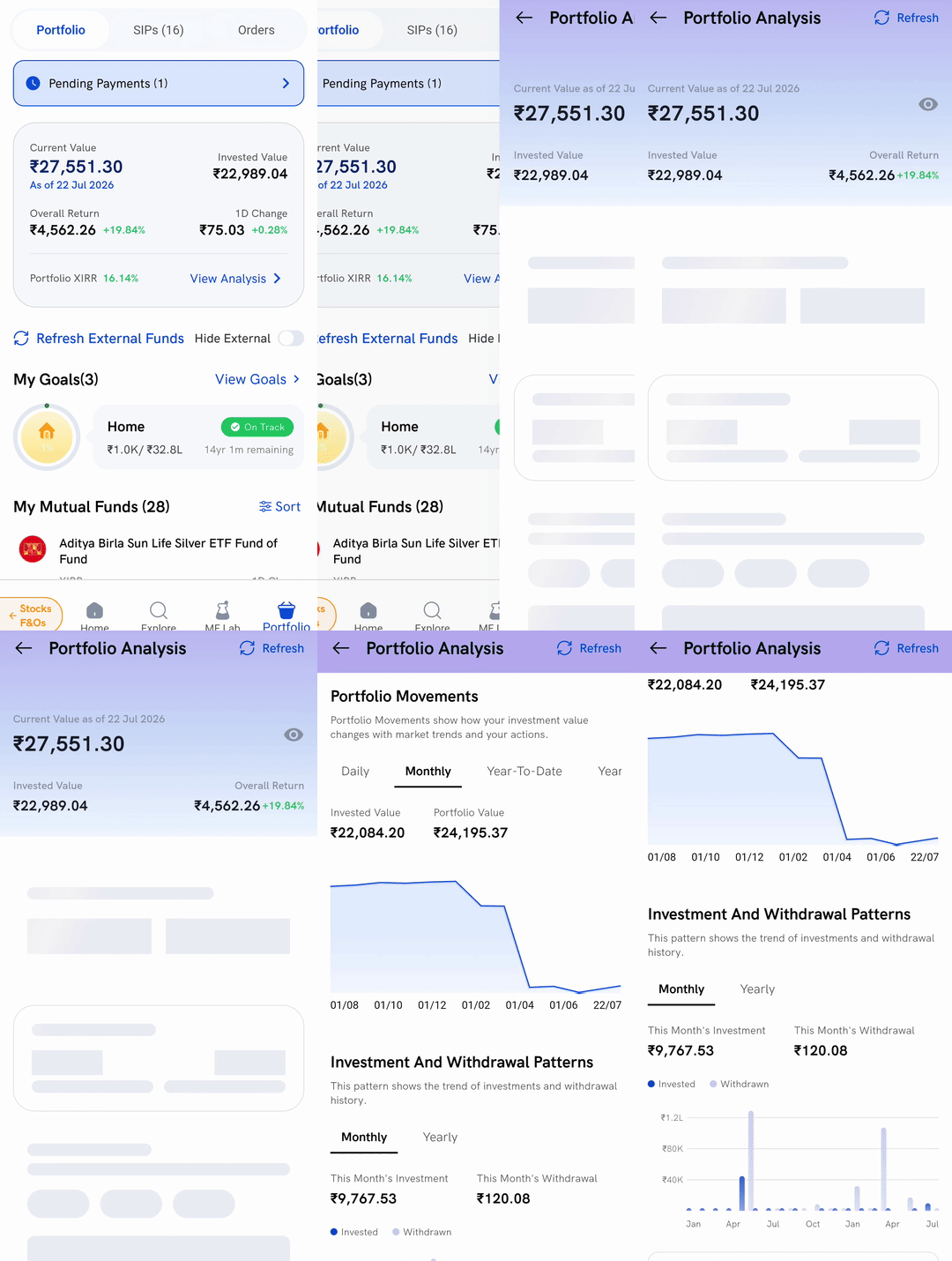
Tap View Analysis on your portfolio value card in the Rupeezy app. This opens Portfolio Analysis, a single screen that answers the questions the portfolio list cannot: how your returns compare with the market, how your value has moved over time, what you have put in and taken out, and how your money is spread across assets, company sizes, sectors and individual companies.
How do I open Portfolio Analysis?
1. Open the Portfolio tab — the value card at the top is your starting point. If you are not sure how to get there, see How to view mutual fund investments on Rupeezy? first.
2. Tap View Analysis — it sits at the bottom right of the value card, on the same row as Portfolio XIRR.
What is at the top of the screen?
The top of Portfolio Analysis repeats your headline numbers so you can read the charts below against them:
- Current Value as of — what everything is worth, followed by the date that valuation is from
- Invested Value — the total you have put in
- Overall Return — the gain or loss, in rupees and as a percentage
This section scrolls away as you move down the page.
How do my returns compare with the market?
The XIRR Analysis card puts Portfolio XIRR next to Nifty 50 XIRR, so you can see whether your funds have beaten the broader market over the period you have been invested. Your portfolio XIRR here is the same figure shown on the portfolio value card — see What is XIRR on Rupeezy? for what it means and where else it appears.
How do I see the way my portfolio value has moved?
Portfolio Movements charts your invested amount against what your portfolio has been worth. Four tabs change the period:
- Daily
- Monthly — the tab the screen opens on
- Year-To-Date
- Year-By-Year
The chart style changes with the tab, and Invested Value and Portfolio Value appear just above it. On Year-To-Date those two figures move inside the chart instead.
If there is nothing to plot for a period, the chart area reads No chart data available, No year-by-year data available or No data available rather than showing an empty graph.
Where can I see what I have invested and withdrawn?
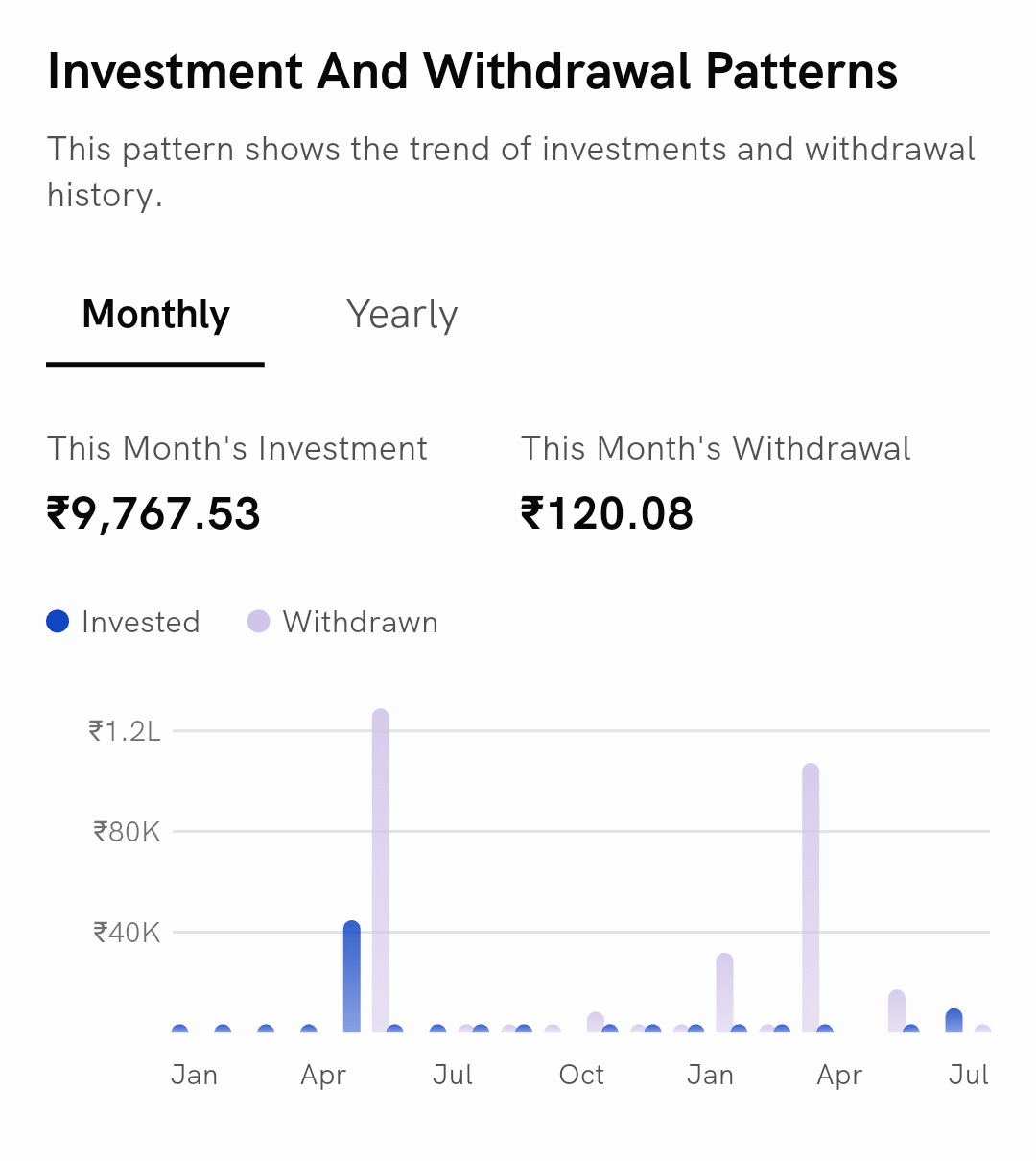
Investment And Withdrawal Patterns puts money in and money out side by side as bars, with a Monthly and a Yearly tab.
Above the chart, two figures track the current period — This Month's Investment and This Month's Withdrawal on the Monthly tab, and This Year's Investment and This Year's Withdrawal on the Yearly tab. In the chart itself, Invested and Withdrawn are the two series.
How is my money split across assets, sectors and companies?
Three cards break the same portfolio down in different ways, and each one opens a fuller view when you tap it:
- Asset Allocation — how much sits in Equity, Debt, Commodity and Others, with a one-line reading of what that mix says about you, such as Your portfolio reflects a Growth investor profile
- Equity Split — how your equity is divided between Large Cap, Mid Cap, Small Cap and Others, with a similar one-line summary, such as Your equity mix is Well Diversified
- Top Sector & Company — the single sector and the single company you are most exposed to, each with its percentage
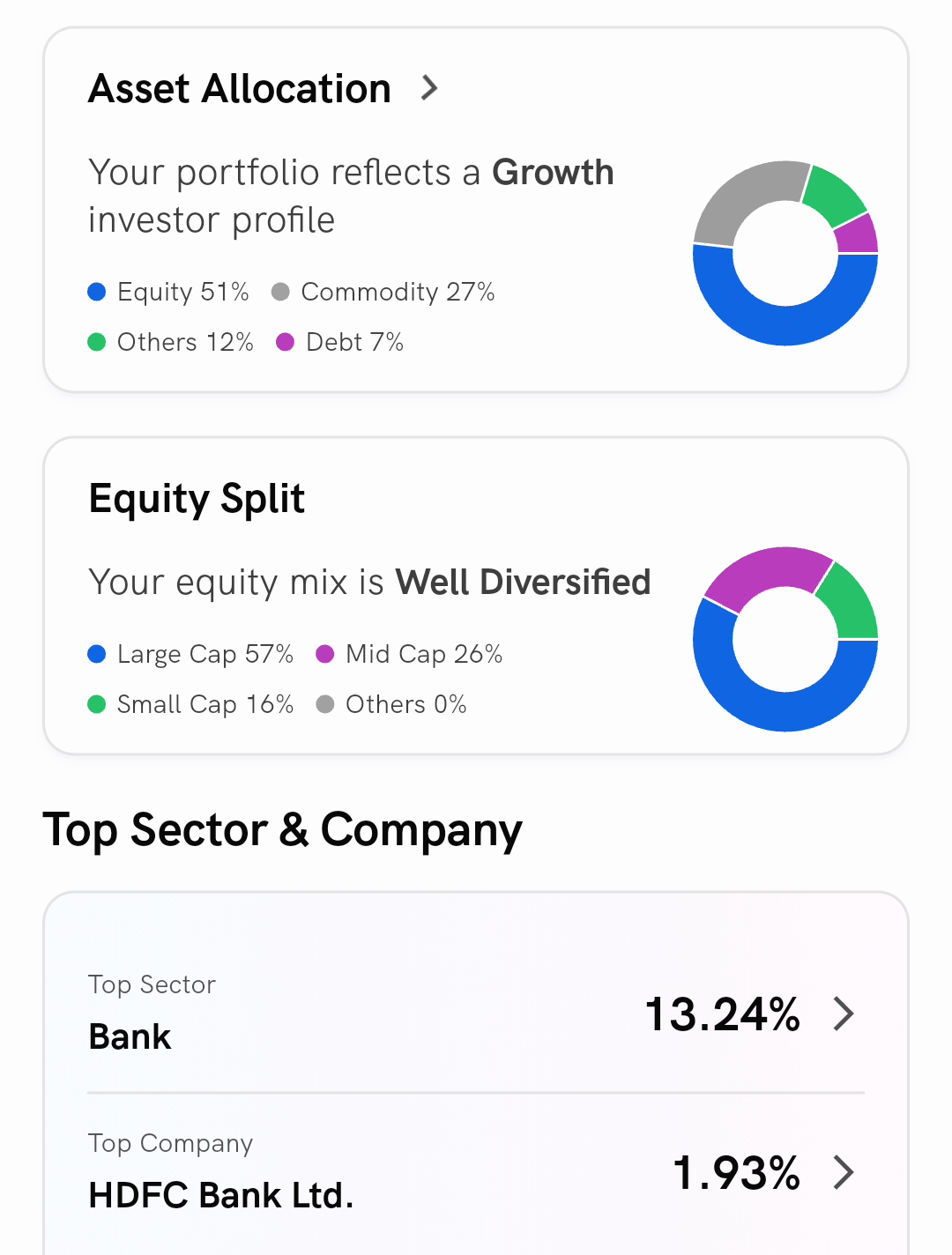
Tapping any of these opens Portfolio Allocation, which carries the same breakdown in more detail across four tabs — Asset, Equity, Sector and Companies — and lets you switch each one between Graph View and List View. You land on the tab matching the card you tapped.
What does Portfolio Drift show?
Your funds do not all grow at the same rate, so the balance between them shifts on its own over time even when you do nothing. Portfolio Drift charts that shift across Equity, Debt, Commodity and Others, which is what tells you whether your portfolio has quietly drifted away from the mix you originally wanted.
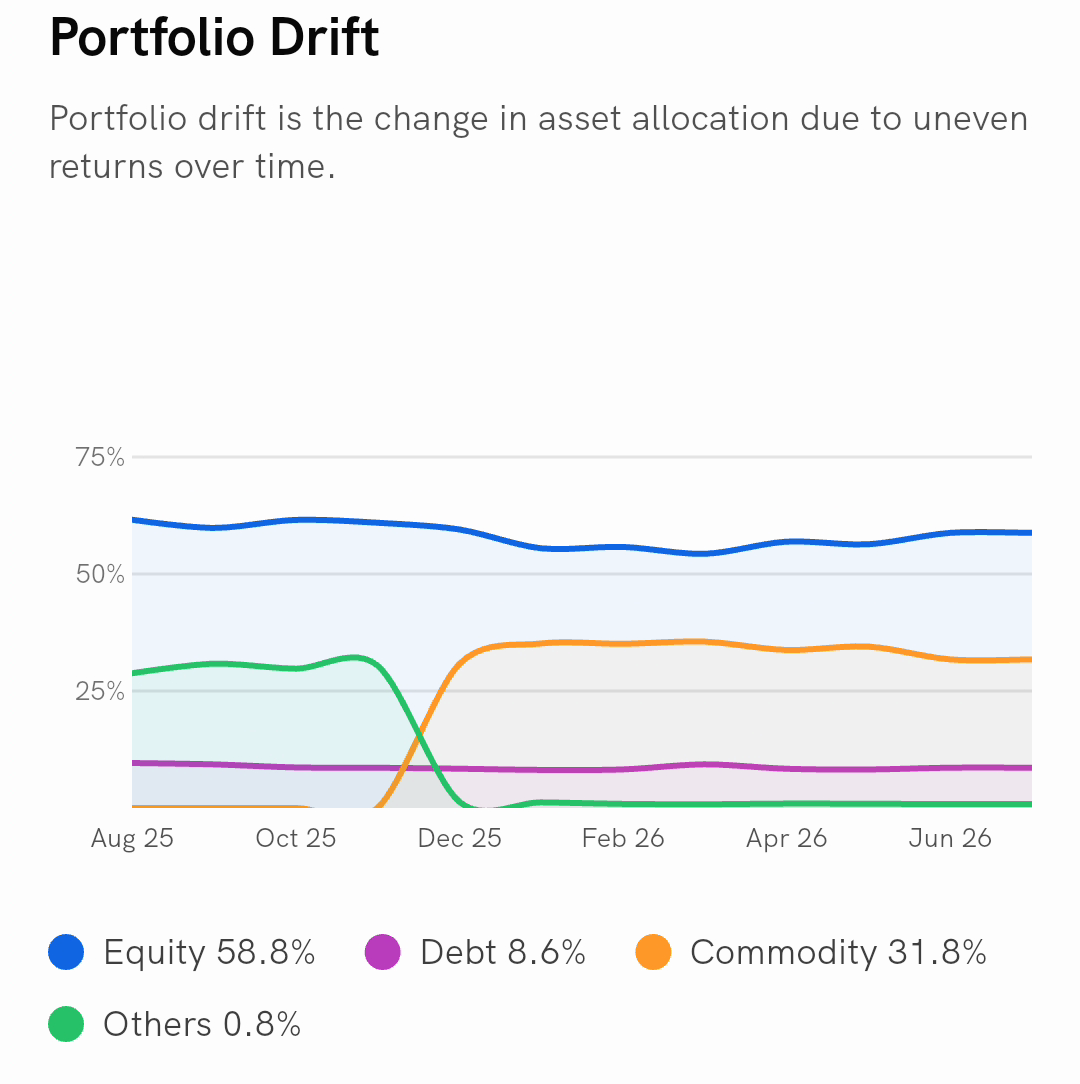
The percentages beside the chart are your split as it stands now. Drift needs a stretch of history to be meaningful, so if your investments are recent this card reads No drift data available instead.
How do I bring in funds I hold elsewhere?
Refresh at the top right of the screen pulls in the latest values for mutual funds you hold outside Rupeezy, so the analysis covers everything you own rather than only what you bought through us. Imported funds are included in every figure and chart on this screen.
While an import is running the button reads Refreshing, and once it is done it reads Refreshed. You can only do this once a day — asking again too soon shows You can only import your funds once in 24 hours.
To reload the charts themselves without touching your external funds, pull down anywhere on the screen.
Things to keep in mind
- These are not live prices. Mutual funds are valued once a day, which is why your current value carries an as of date.
- The figure above the Portfolio Movements chart is your total gain or loss at the latest point in that view, not the movement during that period on its own.
- A card can be missing. Each section is drawn from its own data, so a card sits empty, or does not appear at all, when there is no history behind it yet. This is normal on a young portfolio.
- Percentages are rounded. The summary cards round to whole numbers while the Portfolio Allocation screen shows more precision, so the two can look slightly different.
- Portfolio Analysis is not MF Lab. This screen analyses the funds you actually hold. MF Lab analyses a basket you put together yourself, to test an idea before you invest in it.